
Lavender Color Meaning | Connotations, Palettes & Hex
If you’re looking for a purple that’s soft but not too dainty or whimsical, lavender could be just the color you’re looking for; its bluish undertone gives it a slightly more restrained character than more pink-leaning shades of purple like lilac or mauve.
Quillbot’s free online Color Palette Generator tool can extract the color codes from an image containing a shade of lavender you like.

Key takeaways
- Lavender is a pale, bluish shade of purple that is generally cooler and more restrained than lilac or mauve.
- Lavender is associated with serenity, balance, imagination, creativity, and gentle refinement.
- Lavender pairs well with soft neutrals and greens for a calm look, or with apricot, teal, and ink blue for a more creative color scheme.
Continue reading: Lavender Color Meaning | Connotations, Palettes & Hex
Turquoise Color Meaning | Connotations & Hex Codes
The color name turquoise describes a range of colors at the border between blue and green on the color wheel.
The color of the most sought-after turquoise gemstones is a greenish blue. But colors described as “turquoise” in English often sit on the green side of cyan—the color halfway between blue and green on digital color wheels such as Quillbot’s free Color Wheel. These blueish-green shades of turquoise are also often described as “aqua.”

Key takeaways
- Turquoise describes a range of blue-green colors.
- The CSS color “Turquoise” has the hex code #40E0D0, which produces a green-leaning turquoise.
- Turquoise is often associated with clarity, freshness, balance, creativity, and openness.
Continue reading: Turquoise Color Meaning | Connotations & Hex Codes
Baby Blue Color Meaning | Connotations & Hex Codes
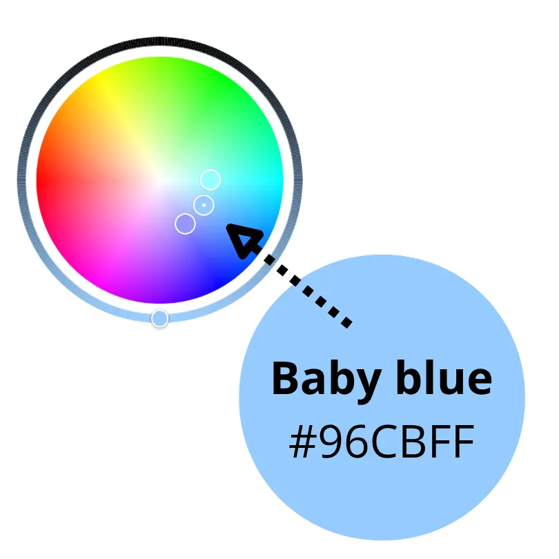
The color name baby blue describes a range of pale, soft blue shades that sit between pure blue and cyan on the color wheel. Baby blue overlaps with color names including powder blue, light blue, and pastel blue.
Find the perfect shade of baby blue for your project using Quillbot’s free online Color Wheel tool.
Key takeaways
- Baby blue is a soft, pale blue shade that overlaps with related color names like powder blue, light blue, and pastel blue.
- The color is often associated with calm, safety, trust, innocence, and new beginnings, making it useful for gentle branding and soothing interior design.
- There is no single official baby blue hex code, but common options include #89CFF0, #B0E0E6, and #87CEEB.
Continue reading: Baby Blue Color Meaning | Connotations & Hex Codes
Bright Yellow Color Meaning | Connotations & Hex
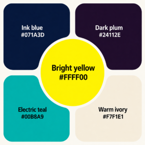
Shades of yellow described as bright yellow have very high saturation, meaning the color looks pure, vivid, and intense rather than shifted toward gray or softened into a pale tint.
To make bright yellow look even more vivid, pair it with dark, muted, or neutral colors and use it as a focused accent rather than surrounding it with other highly saturated hues.
You can extract the color codes from an image with a bright yellow color scheme using Quillbot’s free Color Palette Generator tool.
Key takeaways
- Bright yellow is a highly saturated, vivid color that feels energetic, optimistic, and attention-grabbing.
- In branding, bright yellow can help logos, packaging, and campaign visuals feel bold, cheerful, urgent, and easy to notice.
- For maximum impact, pair bright yellow with dark, muted, or neutral colors.
Continue reading: Bright Yellow Color Meaning | Connotations & Hex
Color Match Game
Recreate the target color by mixing virtual paint. Click the paint circles and try to get the closest match possible.
Target Color
Your Mix
How to Play
- Choose a difficulty level.
- Look at the target color.
- Click paint circles to add paint.
- Watch your match percentage increase.
- Try to reach 100% and start a new round.
Continue reading: Color Match Game
Lilac Color Meaning | Connotations & Hex Codes
If pale pink feels a bit too sugary and lavender’s a little too cool or subdued, lilac could be the color with the personality you’re looking for.
With just the faintest dash of red coming through in its rosy undertone, lilac is one of the warmer, more characterful shades of pale purple.
You can extract the color codes from an image with a lilac color scheme you like using Quillbot’s free online Color Palette Generator.
Put your design instincts to the test with our color matching game.

Key takeaways
- Lilac is a pale, pink-leaning purple that feels warmer and more expressive than lavender, making it a soft but characterful color choice.
- The color often symbolizes romance, creativity, calm, nostalgia, and springtime, which makes it especially useful for gentle, elegant, or dreamy design styles.
- Lilac works well in branding for categories like skincare, wellness, florals, stationery, and lifestyle goods as well as in interiors for bedrooms, nurseries, bathrooms, and relaxing spaces.
- Pair lilac with colors like soft apricot, blush pink, mauve, plum gray, ivory, or cream to create palettes that feel imaginative, refined, romantic, or soothing.
Continue reading: Lilac Color Meaning | Connotations & Hex Codes
Pastel Yellow Color Meaning | Connotations & Hex
Colors described as pastel yellow are soft, pale shades of yellow that tend to look slightly more yellow and intense than colors named “light yellow.”
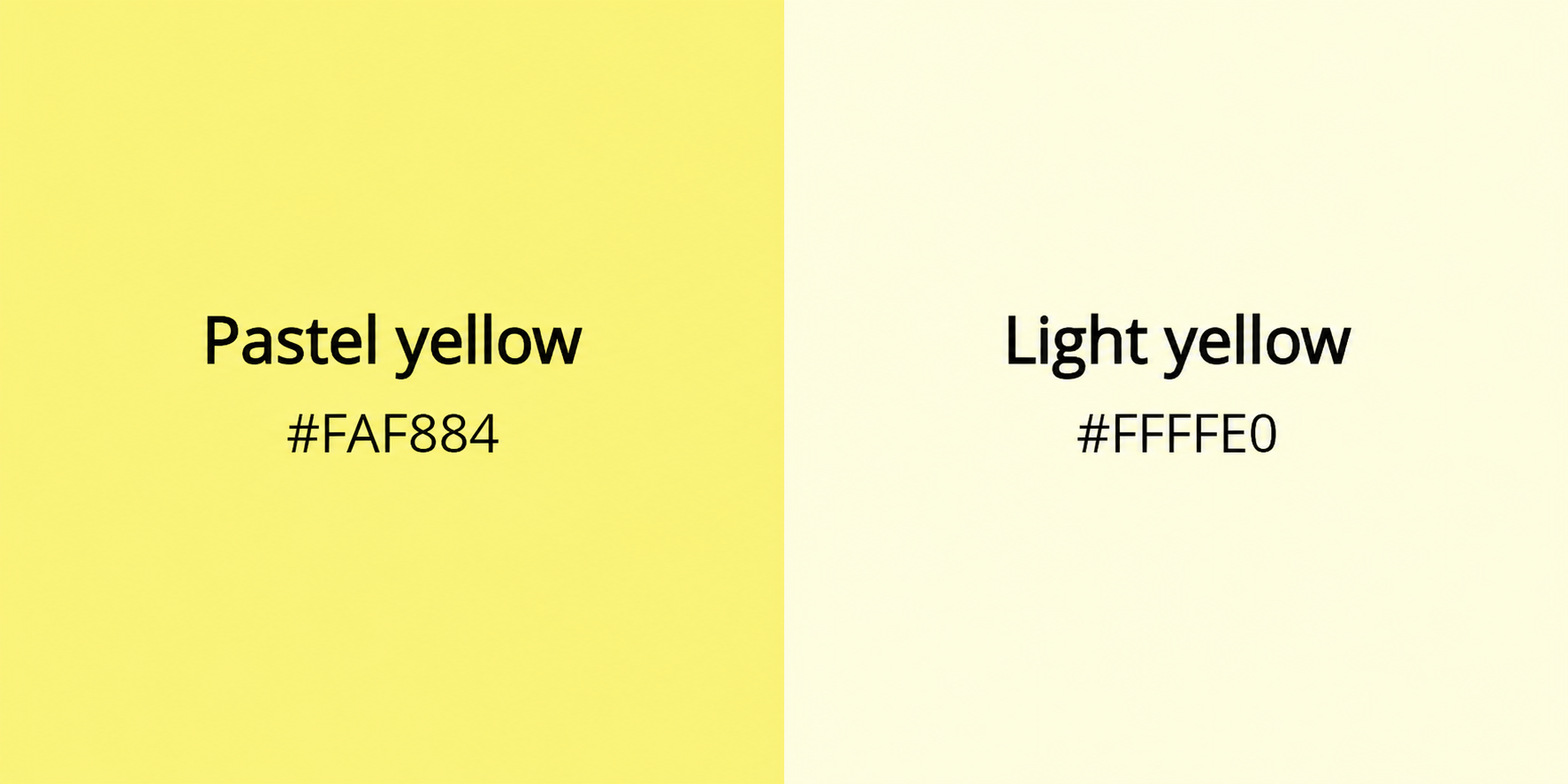
You can use Quillbot’s free online Color Wheel tool to find the perfect shade of pastel yellow for your design—start with the base hex code #FAF884 and dial in your color by making slight adjustments using the color pointer and lightness slider.
Ready for a color challenge? Try our Color Mixing Game.
Key takeaways
- Pastel yellow is a soft, subdued shade of yellow associated with peace, freshness, optimism, and friendliness.
- Because it feels gentler than bright or neon yellow, it can create a warm, welcoming, positive mood in branding, especially for wellness, children’s products, skincare, stationery, spring collections, and lifestyle products.
- In interior design, pastel yellow can make bedrooms, nurseries, kitchens, and reading areas feel brighter, lighter, calmer, and more cheerful without overwhelming the space.
Continue reading: Pastel Yellow Color Meaning | Connotations & Hex
Gold Color Meaning | Connotations & Hex Codes
The color name gold encompasses a range of warm yellow, yellow-orange, and brownish-yellow shades associated with the precious metal of the same name. Objects and surfaces described as “gold” typically have a metallic quality—produced using paints or coatings with light-reflecting properties and conveyed in drawings or on screens through highlights, shadows, and gradients.
This article explores the meaning of the color gold and presents metallic gold color combinations—including gold hex codes—to help you build a gold color palette for your project.

Put your design instincts to the test with our color matching game.
Key takeaways
- Gold is a warm, metallic color associated with luxury, success, prestige, and lasting value, making it a powerful choice for branding, interiors, and visual design.
- This guide explains what gold symbolizes, shares key gold hex codes like #FFD700, and presents gold color palettes to achieve different moods—from glamorous and exclusive to warm and sophisticated.
Continue reading: Gold Color Meaning | Connotations & Hex Codes
Burgundy Color Meaning | Connotations & Color Codes
Burgundy is a deep, rich shade of red that’s bold without being loud and combines well with deep greens, yellows, and blues.
If you’ve found a burgundy color palette you like in an image, upload it to Quillbot’s free Color Palette Generator to find out the codes of the main colors in the image.
You can also test your color-matching skills in our interactive color mixing game.
Key takeaways
- Burgundy is a deep, purplish wine red that conveys sophistication, authority, warmth, and quiet luxury without feeling flashy.
- This guide explains what burgundy symbolizes, how it differs from maroon, common hex codes to use, and practical color palettes for branding and interiors.
Continue reading: Burgundy Color Meaning | Connotations & Color Codes
Brown Color Meaning | Connotations & Hex Codes
Before you dismiss brown as dull and boring, it might be worth giving it a second thought—especially if you’re looking for a color that communicates authenticity, reliability, or subtle sophistication.
This article explores the meaning of the color brown and presents a range of brown colors and color combinations to help you create your own brown color palette.
Just prompt the generator with a description of your design and ask for a rendering in brown (e.g., “Show me a mock-up of a modern reception area that uses a brown, cream, white, and gray color palette”).
Test your color-matching skills in our interactive color mixing game.
Key takeaways
- Brown can make designs feel natural, warm, honest, and quietly sophisticated.
- In branding, brown is useful for communicating sustainability, craftsmanship, heritage, and reliability
- In interiors, brown helps create cozy, welcoming, timeless spaces.
- Explore the brown hex codes and palette ideas below to find combinations that feel earthy, elegant, or subtly luxurious.
Continue reading: Brown Color Meaning | Connotations & Hex Codes